
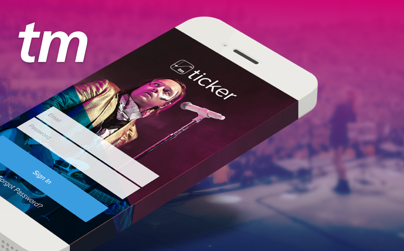
Ticketmaster ONE | Data Visualization
B2B Ecosystem | 2015-2016

Designed around the event lifecycle

Interactive Seat Map
Problem
Ticker’s users were asking for a seat map report. Ticketmaster had several interactive seat maps, with varying functionality and architectures. We set out to identify what pain points the seat map would actually solve, and what level of complexity our users truly needed out of this feature.
Who is involved?
Venue Execs and Box Office Managers
Process
We compared all of our available seat maps, and sketched out and then mocked up various ways we could integrate seat maps into Ticker. We then conducted remote usability tests with several venue execs and BO managers across the US.
Results
We found out that while our users would like the amount of functionality in our Venue Creator, or Fan eCommerce seat maps, they didn’t need that level of information.
Visually understand how an arena is selling.
Identify mistakes in held or killed seats. ie: if a pillar is blocking a couple seats, they want to make sure they can’t be sold.
Quickly identify held or killed seats to release.
Metrics
Success was determined through Pulled Reports, or conversions, and measured through MixPanel..

ANDROID LAUNCH
To prepare for the Android launch, we ran a usability test with core segments of users focused on cleaning up some issues within the information architecture, hierarchy, and overall navigation within Ticker. We used the findings to release a brand new Android version, showcasing a refined UI. This resulted in increasing our Total Unique Users, increasing user satisfaction, and the new app was streamlined to provide quicker loading and response times that were measured through MixPanel.
